Defined Contribution


This article is part of our Retirement Plan Trends series, which explores issues affecting the retirement space.
- Interest has grown around creating personalized portfolios for participants based on data from recordkeepers.
- A key question is whether the potential benefits of personalization can justify the additional cost for the service.
- Depending on the participant’s age and fee level, a personalized portfolio may have to provide a meaningfully different asset allocation than a target date fund to justify the extra cost.
- Plan sponsors should consider what types of participant data would be most relevant for personalization.
Plan sponsors have a renewed interest in personalization. In recent years, technological advances and greater availability of data have resulted in many new products that can create personalized portfolios using participant information readily available from recordkeepers. Of course, personalization within defined contribution (DC) plans comes in many forms. At one end of the spectrum are target date strategies that simply use a participant’s age and planned retirement year. At the other end are managed account solutions that use detailed participant-level data to create a tailored asset allocation.
Cost is a key consideration here, as personalization in the form of managed accounts comes with additional fees. The big questions for fiduciaries are: How can plan sponsors determine if the potential benefits of personalization can justify this extra expense? And which types of participants may benefit most from personalization?
How can we value the benefit of personalization?
One of the challenges when evaluating portfolio customization is defining what success for a given participant looks like. While personalization may result in better outcomes for a participant, “better” does not necessarily mean higher returns. Risk should be considered as well. A personalized portfolio designed to lower risk would likely have a lower expected return but may still be appropriate for that individual’s circumstances.
One way to value personalization is to measure by how much a personalized portfolio would differ from a target date solution whose asset allocation was determined by a participant’s age and retirement date selection. Unless the personalization service offers unique or especially cost-effective additional services, plan sponsors should expect to see participant portfolios customized enough to cover the cost of the service.
We built a model to try to estimate the value of a personalized asset allocation and to determine under what circumstances the benefits might justify the additional costs. Here’s what we concluded: Depending on the participant’s age and fee level, a personalized portfolio may have to provide a meaningfully different asset allocation than a target date fund to deliver enough benefit to justify the extra cost.
Developing the baseline comparison
To calculate the potential benefit of personalization, we needed to compare it to a hypothetical off-the-shelf solution like a target date fund. We developed a “baseline” stock/bond glide path based on the average allocation of the 10 largest target date mutual funds by assets. We conducted separate analyses for two main use cases for personalization:
- Personalization to pursue higher returns: A personalized solution could pursue higher returns for a participant by increasing his or her equity exposure relative to the baseline stock/bond allocation. The greater the increase in equity, the greater the potential for additional return (and the greater the risk).*
- Personalization to reduce downside risk: A personalized solution could seek to reduce drawdown risk from equity-market downturns. One way to pursue that goal is simply reduce the equity exposure relative to the baseline allocation. The greater the decrease in equity, the better the personalized portfolio might preserve capital in equity-market downturns.
For each use case, we adjusted the equity allocation relative to the baseline glide path – either higher or lower. Using some assumed returns for stocks and bonds, we calculated the hypothetical investment outcomes of the personalized portfolios. And we compared those results to that of the baseline glide path. The difference in performance (if positive) represented the financial benefit of personalization over the baseline allocation in our model.
Factoring in cost
Then we factored in cost – specifically, the additional fee that could be charged for using the personalization service. Using some math, we answered the following question: At what fee levels would the hypothetical financial benefit of personalization be totally offset by the additional cost? At these fee levels, participants would be ambivalent about personalization because the net benefit would be zero (the cost would equal the benefit). Above this fee level, personalization may not make economic sense as the costs would exceed the benefits.
Personalization to pursue higher returns
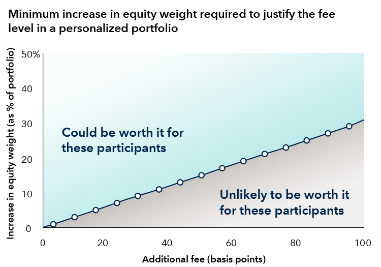
First, let’s turn to the scenario where personalization is used to seek higher returns by increasing the equity exposure. We created a series of personalized portfolios assuming that the equity exposure was increased by 5 percentage point increments from the baseline allocation. We assumed that a participant adopted a personalized portfolio at age 25 and held it until 65. The higher the equity exposure, the greater the investor’s cumulative return advantage over the baseline allocation. Finally, we determined the annualized fee that would potentially offset any additional return from higher equity exposure.
The below chart shows the percentage increase in equity relative to the baseline portfolio on the Y axis and the range of additional fees on the x-axis. The black line is the ambivalence line: the points at which the impact of the additional fee exactly offsets the potential financial gain from increasing the equity exposure. For points above that line (the blue-shaded area), the benefits would likely exceed the costs. For points below the line (the gray-shaded area), the cost would likely exceed the financial gains in our model.
Our analysis illustrated that to account for an extra fee of 40 basis points (bps), this type of personalized portfolio would have to increase equity exposure by at least 10% to generate enough extra return to cover that cost. A personalization service with a lower fee wouldn’t need to change the portfolio by as much to cover its cost. Indeed, a service that adds 5 bps in expenses would only need to move the portfolio’s equity exposure by a few percent.
The takeaway: At higher fee levels, a personalized portfolio seeking greater returns may need to increase the equity exposure by a greater magnitude to cover the extra cost.
How much should a participant pay to pursue higher returns?
For illustrative purposes only.
Source: Capital Group. Based on return assumptions for equities and bonds within the allocation. We estimate the implied change in return as the stock/bond mix changes relative to a baseline hypothetical target date glide path. Based on return assumptions, we calculated the value of the change in asset allocation relative to the baseline. For each change in the stock/bond allocation, we then calculated the annual fee that would equal the additional return over the baseline such that the net financial benefit of the allocation change would be zero. This is reflected in the black line in the chart.
Personalization to seek downside resilience
Seeking downside resilience is a different story, however. We took a slightly different approach for the personalized solution that reduces the equity exposure to pursue greater downside resilience in equity bear markets. In that situation, the investor may care most about how the portfolio might perform in worst-case scenarios. A Monte Carlo simulation that accounts for uncertainty by generating a range of possible outcomes is ideal for this purpose.
We developed a savings scenario for a hypothetical investor, assuming a particular starting salary, starting age, annual contribution rate and salary growth rate. To find the financial benefit of downside resilience, we compared the hypothetical account balance at age 65 for the baseline and the personalized portfolios in worst-case scenarios.
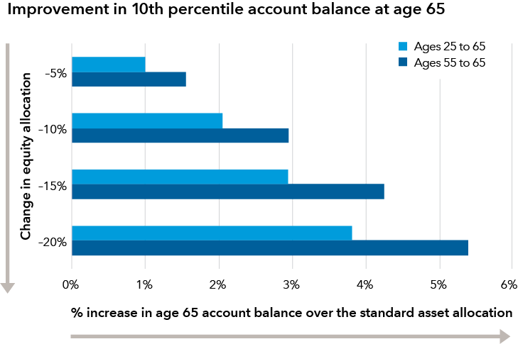
The chart below illustrates the potential benefits of downside protection. Each set of horizontal bars represents a different level of equity reduction from the baseline allocation. The value of each bar shows the percentage improvement in the account balance over the baseline allocation in a worst-case (10th percentile) scenario of the simulation. The benefits of downside protection are greater for investors who are closer to retirement (ages 55 to 65) than for younger investors, and the magnitude of this difference grows the greater the equity is decreased.
Reducing equity exposure can improve outcomes in worst-case scenarios
For illustrative purposes only.
Source: Capital Group. Data represents simulated retirement outcomes for portfolios with varying levels of equity exposure relative to the baseline glide path developed in the Monte Carlo simulation (as described at the end of this article). Based on return assumptions for equities and bonds within the allocation. Chart shows the increase in ending balance at the 10th percentile relative to the baseline glide path, given changes in equity allocations. Refer to the important information at the end of this article about the methodology for this graph.
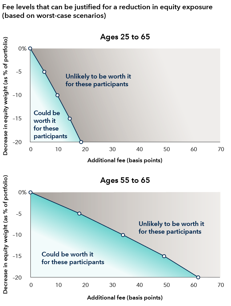
What happens when fees are added to the mix? When would the cost justify the potential benefits? The answer depends on the proximity to retirement as well as the magnitude of portfolio change.
These points are illustrated by the charts below, which show the percentage decrease in equity on the y-axis and the range of additional fees on the x-axis. The first chart assumes that the investor adopts the personalized portfolio at age 25, while the second chart assumes the investor adopts it at age 55.
Let’s assume that the personalized solution decreases the equity exposure by 5% relative to the baseline to seek greater downside protection. With a 5% reduction in equity, investors who are close to retirement (ages 55 to 65) could support paying up to around 18 bps in additional fees for personalization. In contrast, individuals that are further away from retirement (ages 25 to 55) could justify paying only around 5 bps. When looking at a larger decrease in equity of 20%, the fees that potentially could be supported exceed 60 bps for near-retirement investors. But investors further from retirement could justify paying at most 15 to 20 bps.
The takeaway:
- Participants closer to retirement may derive more value from risk reduction, and therefore may be able to bear a higher fee for this personalization service.
- Participants who see larger reductions in equity could justify paying higher fees.
What cost should participants be willing to pay to pursue downside resilience?
For illustrative purposes only.
Source: Capital Group. Refer to the important information at the end of this article about the methodology for this graph.
Which participant factors matter most?
Key to evaluating personalization in a DC plan is looking at how much the base case asset allocation changes with additional participant information. A Defined Contribution Institutional Investment Association (DCIIA) survey on managed account providers showed that the largest change comes from age, which is also the key demographic feature used in target date strategies. DCIIA also found that the presence of outside assets, as well as whether or not the participant was withdrawing assets, were demographic details that could meaningfully change a participant’s portfolio. Other elements of a participant’s profile generally had smaller impacts on the asset allocation in their survey. Lastly, portfolio customization varied by managed account provider, suggesting that different providers may construct different portfolio changes given the same demographic inputs.
The impact of personalization services
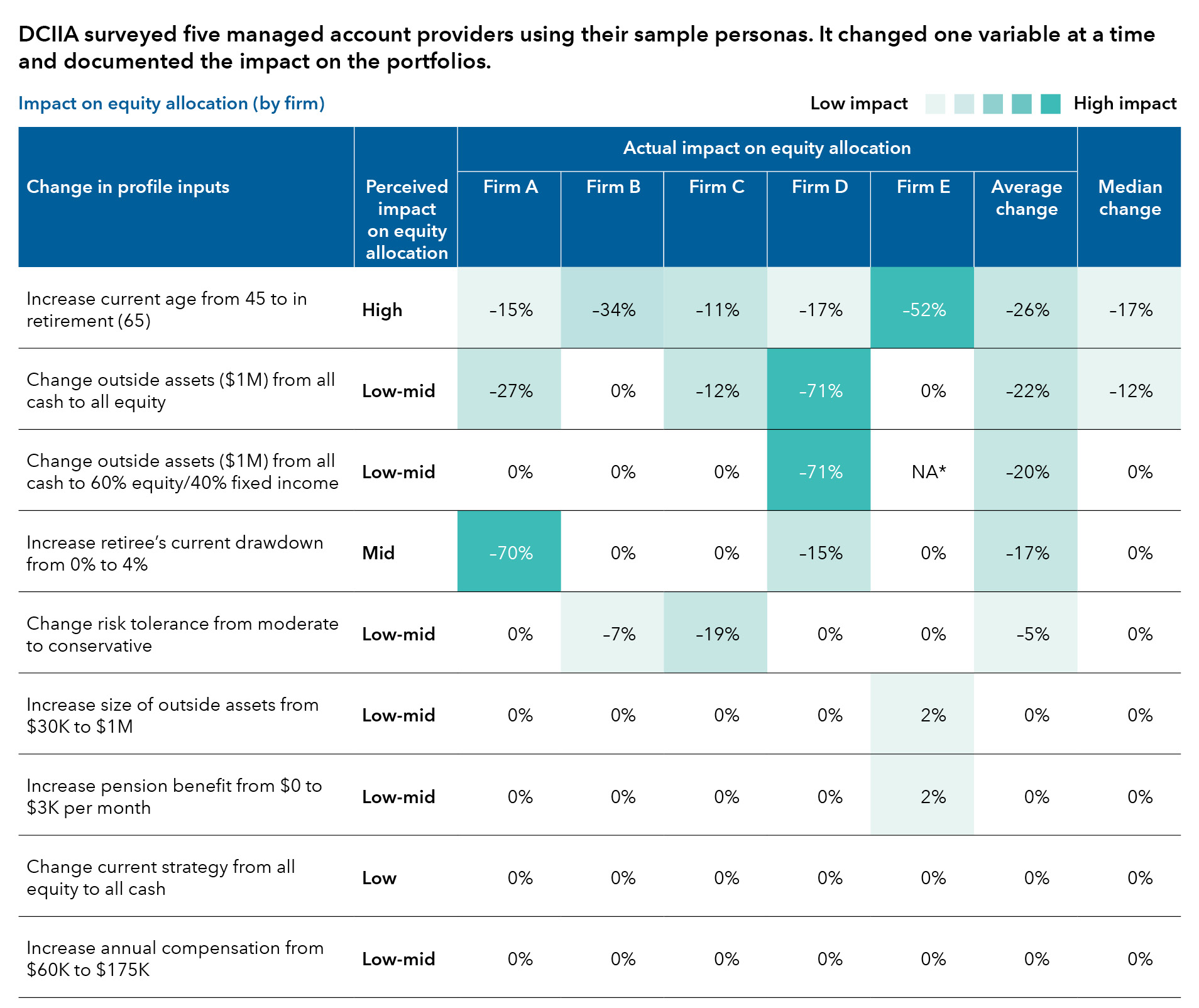
Source: DCIIA. Managed Accounts Asset Allocation Review. November 2021. Data shows the change in equity allocations (as % of the portfolio) each firm made to their sample persona’s portfolios based on the change in profile input.
The takeaway for plan sponsors: When evaluating a personalization solution, ask what demographic information makes the biggest changes to participant portfolios. Assess whether this is relevant for your participants.
Sample framework for evaluation of personalization services:
- Understand your population.
- Identify where you have demographic variation across your participant base.
- Assess the extent to which personalization adds value relative to its cost.
How might this look in practice?
Develop default personas representing your plan population. Additionally, create alternative personas representing common variations in your participant base. This may include:
- Asking the personalization provider which factors are most important in customizing asset allocation.
- Submitting your personas to the personalization provider to measure how much your participants’ portfolios might change.
- Gauging whether a sufficient number of participant portfolios could change enough to justify the cost.
While a customized asset allocation is one key aspect of supporting the fees that come along with personalization in DC plans, these services often come with other benefits. Many personalization programs offer enhanced education on retirement and financial wellness, which can increase engagement and saving rates for individuals. Getting participants to put an extra dollar into retirement savings can be even more impactful than asset allocation decisions. These additional benefits should not be ignored, but it can be helpful to separate them from the evaluation of portfolio customization itself.
As personalization is explored in defined contribution, plan sponsors can benefit from thinking about their participants: How they might engage with a personalization service and how much value could they get from it, including both changes to the portfolio and other features that may improve opportunities for success in retirement.
Don't miss our latest insights.
Our latest insights
-
Liability-Driven Investing
-
Defined Contribution
-
Defined Benefit
-
-
Liability-Driven Investing
*Over long periods, equities have tended to outpace bonds. Equities also have tended to lag bonds in bear markets. Of course, an individual investor’s actual experience will vary depending on the time period and the types of stocks and bonds that are held. Although this model and its assumed equity and bond returns are useful for illustrating the potential benefits and trade-offs of personalization, the model is not meant to be predictive.
Basis point: 1 basis point is one-hundredth of 1 percent (0.01%).
Interpreting value of portfolio personalization figures: We believe the concept that larger portfolio changes can create greater changes in participant outcomes (and thus can be worth more to participants) is a robust observation. The exact value of a given change in portfolio allocation is expressed as an output of the models we applied, and may vary with assumptions of the participant persona or the assumed rate of return and standard deviation (volatility) of the participant portfolios (which are sensitive to the specific asset classes included in the portfolios as well as the capital market assumptions associated with those assets).
Methodology for how much a participant should pay to pursue downside resilience: Figures based on Monte Carlo simulation using a sample glide path, assumed values for returns, risk and corelation for stocks and for bonds, and two hypothetical participant personas. The sample glide path is based on the average stock/bond allocation of the 10 largest target date series by mutual fund assets as of 12/31/2022 based on data from Morningstar. We construct four additional glide paths where we reduce the level of equity across the glide path in 5% increments. We estimate the value/fee as the cost that a participant could pay per year that would result in the same portfolio value at the 10th percentile at age 65 based on different levels of equity reduction to the sample glide path (lower percentiles indicate worst-case scenarios). We simulate ending account balances at retirement age for the two participant personas, one beginning at age 25 the other at age 55. We calculate the per annum fee that would equivocate the ending account balances at the 10th percentile at age 65 between the lower equity glide path and the original sample glide path. The personas both assume a 10% annual contribution rate and 3% annual salary growth. The starting balance for the 25-year-old is assumed to be $0 and the starting balance for the 55-year-old is assumed to be $250,000. The starting salary for the 25-year-old is assumed to be $45,000, and the starting salary for the 55-year-old is assumed to be $109,227 (which is $45,000 grown by 3% for 30 years).
Information about Monte Carlo simulations: Monte Carlo simulation is a statistical technique that, through a large number of random scenarios, calculates estimated returns and a range of outcomes that is based on the assumptions included in this analysis. This is provided for informational purposes only, and is not intended to provide any assurance of actual results. The simulation will not capture low-probability, high-impact outcomes. The results of the simulations may be presented in the form of percentiles, reflecting the probability distribution of the portfolio values and statistics. While we believe the calculations to be reliable, we cannot guarantee their accuracy.