MARKETING

Website makeover: 5 improvements to help advisors boost leads

8 MIN ARTICLE

It doesn’t take a digital marketing whiz to understand the importance of having a website. In today’s world of online comparison shopping, consumer research and validation, it’s all but impossible for a financial advisor’s practice to thrive without one. 


A website can be a digital billboard for your business, helping you establish your brand and communicate with clients more efficiently. Perhaps most importantly, a website can create an experience that inspires prospective clients to take the next step and request a meeting with you. 


There’s a difference, however, between having a website and using your website to drive investor interest and online leads. A website that is used to its maximum potential — with a strong brand message that speaks to an ideal client and anticipates their specific needs — is more likely to bring qualified prospects to your practice. 


How can you tell if your website is reaching its potential? Start by looking at it from the point of view of a new user: Is your messaging clear? Is there a clear journey to get to the information you want them to act on? You might also consider user testing, which could be outsourced to a professional or done by unbiased volunteers among friends and family. Ask them what types of questions they would expect to find answers to on your site. How easily do they find answers? Do they understand what you do and whom you serve? Most importantly, would they be inclined to schedule an initial meeting? 


Regardless of where your website stands today, here are five strategies that can help drive digital business to your practice. 

1. Revisit website essentials with your ideal client in mind


Think of your website as an elevator pitch. What’s the immediate takeaway? Digital marketing agency FMG Suite, which works with financial advisors to build more effective digital destinations, suggests performing a “five-second test.”1 If someone spent just five seconds on your website, would they have a clear and immediate understanding of your business and what you offer? Would ideal prospective clients recognize themselves immediately? If you are not sure, consider whether your site includes these successful attributes:
 

  • Clear brand message: Beyond a value proposition, your brand message communicates why you do what you do. Being able to articulate your “why” can help you position yourself in the marketplace, establish a business identity and speak to the perspective of your ideal client. Once you have a brand message, it should be clearly stated — from the top of your business landing page and throughout every client touchpoint.
  • Practice specialization: Who are your clients? Do you have ideal clients with similar goals, passions, net worth, industries or backgrounds? Do you have unique skills or capabilities to help serve a specific segment? If your specialization is not part of your brand message, find ways to speak to these prospective clients in words that make sense to them. Focus on their goals and their problems to solve. 
  • About Us page: Easily overlooked, the About Us page is one of the most important areas of your site. A fully realized team page with biographies and images can speak directly to customers, differentiate your brand, and build authority and trust (which speaks to prospects and can help boost your results in search engines). To create an even more personal message, more and more advisors are adding video to introduce themselves and add a voice to the business. 
  • FAQs: There are many reasons to include answers to common client questions on your website. Being able to find answers on the website can help create a positive user experience and cut down on time spent on basic questions or unqualified leads. These answers can also be turned into educational content that can be used to actively attract clients through other digital channels, such as social media, YouTube or email. And if you consider the important keywords contained in the questions you receive most, having them on your site may help improve search engine results. You can easily build a content marketing campaign around these answers. Just remember to keep it in your own words and be as clear and concise as possible. 
  • Mobile-friendly layout: Because everything on the desktop version of your website should also be found and accessible on mobile, today’s website developers opt for a mobile-first approach to design and content. This means making sure that images and copy blocks look just as good on your phone as they do on your desktop, and that it’s easy to close any pop-ups or collapse large blocks of copy to scroll down the page quickly. Video and audio can also help increase mobile engagement.
  • How to talk to us:  Questions? Reach out to us. Schedule a meeting. Free consultation. Find us on Facebook or LinkedIn. Don’t forget our newsletter. These are the types of messages that offer easy ways for your web users to connect with you, which also allow you to capture their email and other contact information. 

2. Rethink engaging content types (like video)


Having a content strategy can help drive traffic to your practice’s website and create more engaging social media profiles, and it can help you answer your clients’ frequently asked questions. But content does not have to be just articles or blog posts. There are other tools that can help your website both stand out and draw prospects in — for example, infographics, quizzes, surveys, downloadable reports, newsletter sign-ups and live webinars. These alternative content types can help you educate and capture data from a prospective client, while giving them something completely unexpected or unique.  


One content tool that can be highly effective is a video. According to a 2022 survey of website managers who use video by design company Render Forest, 78% got more traffic to their website after adding video, 83% generated new leads with the help of video content, and 44% of users increased their sales. In another example, marketing guru Neil Patel says a prominently displayed video2 helped to double conversion rates for his website’s already high-performing landing page. 

The persuasive power of video


A recent study asked website managers for results after adding video to their marketing efforts. 

Under a heading “results of adding website video” are three bold statistics. The first is 78% increased website traffic. The second is 83% generated new leads. The third is 44% increased sales.

Source: Render Forest, 52 Video Marketing Statistics 2022

Video can be extremely persuasive, putting a face and voice behind the business and the brand. It is an ideal vehicle for storytelling, and can help touch the emotions of your ideal prospects by addressing common pain points. Video can also help establish trust and reinforce your authority, which is a crucial component in search engine optimization (SEO).  Additionally, with attention spans on the decrease, videos can be easier to consume than articles. They are easily watched and shared by mobile phone users. 


Speaking of smartphones, they make it easy for to create video at relatively no cost. But if you are looking to improve the quality of your production, there are programs you can use to create videos with a professional look and feel. InVideo can help simplify the process of editing and presenting a broadcast-quality product. Render Forest offers a free online video maker tool, and there are many other user-friendly editing tools to consider (some at low or no cost), including FlixierDescript and iMovie. And don't worry if you're not an on-screen expert. The important thing is to create an authentic message that fosters a connection with your ideal client. 


When you post the video to your website, remember to add a link to the transcript. This helps search engines find and rank your video content. 

3. Create clear and compelling calls to action 


A call to action (CTA) is a prominently displayed link or button offering users to take a next step: Learn More, Find Out How, Buy Now and so on. The CTAs on your website can function as a sort of road map that helps guide users through the decision-making process. Effective CTAs can help draw users closer to converting from a website visitor to a prospect or client. 


What makes a CTA effective? First, it should be easy to find. Including big, bold CTAs throughout your site encourages deeper engagement with your web pages. The language should feel personal and active. For financial advisors, effective CTAs might include: Request a meeting, Reach out with questions, Talk with an advisor, or Schedule a free consultation. Words like “free” or “complimentary” can compel users even further. For example, if your goal is to build an email list, you might use a newsletter sign-up or offer something more robust in return for an email address (for example, a guide to paying off debt or a free college savings roadmap).

A call for every action


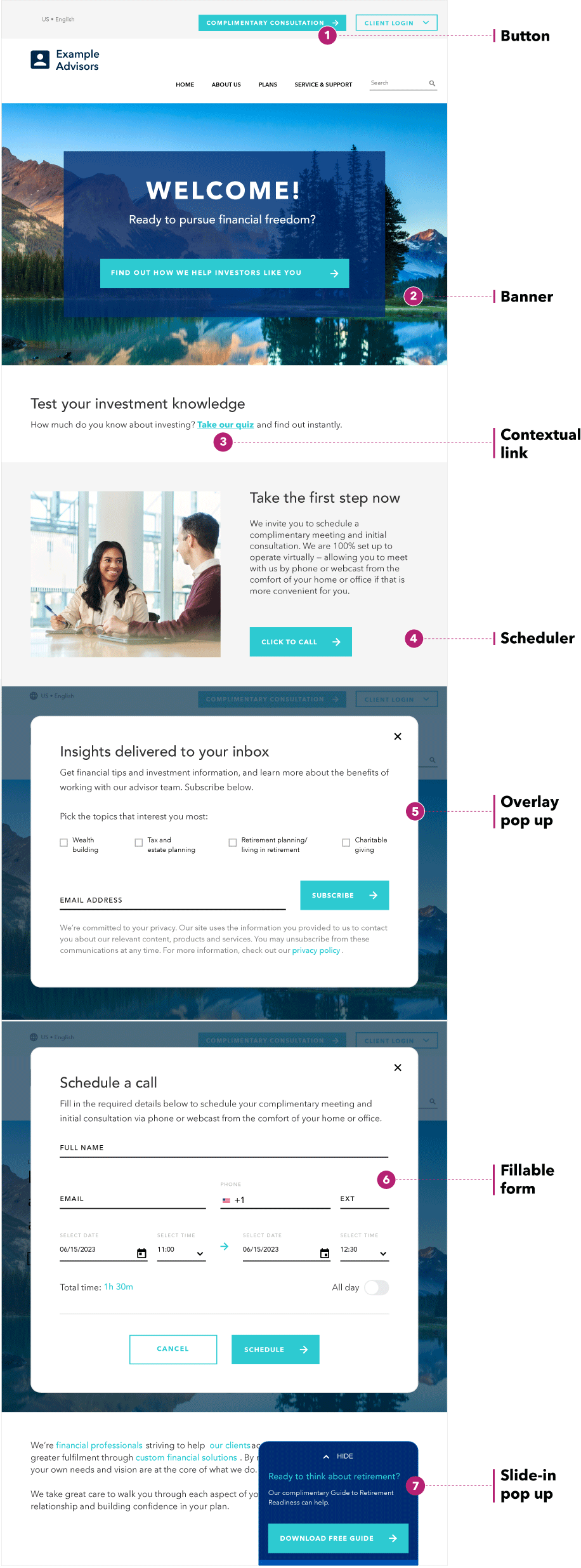
CTAs can be designed in many different ways and placed throughout the page, depending on what you want your prospective client's journey to look like. 

Image of a website with a variety of calls to action called out. At the top right of the page is 1. Button and it points to a button that reads “Complimentary consultation” next to another button that reads “Client login.” Below that is 2. Banner, and it points to a large image across the top of the website reads “Welcome! Ready to pursue financial freedom?” with a clickable button underneath that reads “Find out how we help investors like you.” Next  is 3. Contextual link, which points to a line that reads “How much do you know about investing? Take our quiz and find out instantly.” The words “take our quiz” are hyperlinked. Next is 4. Scheduler, which is an example of a Click to call button. The text above it reads: “Take the next step. We invite you to schedule a complimentary meeting and initial  consultation. We are 100% set up to operate virtually – allowing you to meet us by phone or webcast from the comfort of your home or office if that’s more convenient for you.” Next is 5. Overlay popup, which is a popup box encouraging users to subscribe to a newsletter. It reads “Insights delivered to your inbox. Get financial tips and investment information, and learn  more about the benefits of working with our advisor team. Subscribe below.” Underneath is a line “Pick the topics that interest you most,” with four boxes: wealth building, tax and estate planning, retirement planning/living in retirement, charitable giving. There is a line for an email address and a button reading Subscribe. Next is 6. Fillable form. It shows a screen with the header “Schedule a call. Fill in the required details below to schedule your  complimentary meeting and initial consultation via phone or webcast from the comfort of your home or office.” There are fillable lines to type your full name, email, phone number and extension, as well as options to select dates and times for the meeting. There is a total time display beneath, as well as a toggle to select All day. At the bottom are two buttons: Cancel and Schedule. The final example is 7. Slide-in popup. It shows a tab that covers the copy on the lower left side of the screen. It reads “Ready to think about retirement? Our complimentary Guide to Retirement Readiness can help. There is a button at the bottom of the slide-in popup that reads Download Free Guide

Source: Capital Group research, 2023.

Your CTAs should also make it easy for web users to take the next best action. There are many potential ways to design a CTA — from buttons and banners, to contextual links, to fillable forms, pop-ups and slide-in boxes. The type you choose should fit the desired user action. For example, a “click to call” feature or meeting scheduler can help automate that experience for the prospective client.

4. Integrate your website with your CRM


As you may already know, a customer relationship management (CRM) system can be a great tool to help you manage client data and create a seamless experience. It can also help you track your online marketing activity and new leads. Integrating CRM software into your website can help you further optimize your digital strategy with a complete view of who interacts with your website and how they behave. This allows you to cultivate leads over time and even segment clients according to user data.


Many of the most popular CRM software suites for advisors, including SalesforceRedtail and URGU Financial, offer digital marketing services or pair with other third-party software integrations that do. 

5. Track engagement with web analytics


Capturing the activity on your website and collecting information about what visitors are doing requires web analytics: a data-based view of your website’s performance. Which pages are bringing them in? Which pages are they spending the most time on? Where did they come from before they got to your site? Where do they go when they leave? Analytics can help you understand all this and more, and help you segment your data and optimize your site over time. 


For example, you may want to compare total page views to average page views per visit, or compare new visitors to returning visitors. You may pay attention to the time spent on the page or consider the “bounce rate” — calculated as single-page sessions divided by total sessions. A low bounce rate (around 30%-50%) can tell you that visitors stay and spend time on the site; a high bounce rate (generally greater than 70%) can indicate that users are viewing one page and navigating away quickly. You may also want to look at individual page views, to see which pages are getting the most traffic. Your most popular pages can be leveraged to boost your other content by adding hyperlinks to related articles.

Which metrics to watch?


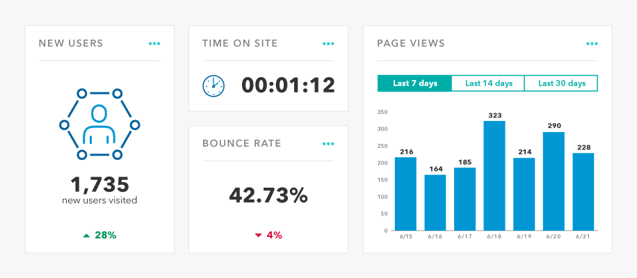
A metrics dashboard will provide a lot of website user data. Here are a few examples of what you might want to pay attention to.

Graphic representation of what a metrics dashboard might look like in four boxes. On the left is a box labeled New Users. It shows that 1,735 new users visited, and indicates this was an increase of 28%. In the middle there are two stacked boxes. The top box is labeled Time on Site and it shows one minute 12 seconds. The bottom box is labeled Bounce rate and it shows 42.73%, and indicates this is down 4%. On the right is a box labeled Page views. It shows three options: Last 7 days, last 14 days and last 30 days. The tab is set to last 7 days and a bar chart underneath shows page views for those days.

Source: Render Forest, 52 Video Marketing Statistics 2022

Google Analytics is a great tool for web analysis. It’s a dashboard that can be added to your website through a simple plug-in, and it tracks web data in real time, including conversions, social media, mobile and video performance, and multichannel reporting. The standard version is free, and in terms of functionality, it’s hard to beat. Many content management systems (including WordPress, Squarespace, Drupal and GoDaddy, among others) support Analytics as part of their platforms, but you can easily create a Google Analytics account and add your website to it. Alternatively, your content management system may have similar built-in analytics. For example, users of Adobe Experience Management have access to Adobe Analytics.  


Depending on the level of enhancement your website needs, you may decide to work with a digital agency like FMG SuiteIndigo Marketing Agency or Paladin Digital Marketing, among many others. Keep in mind, however, that the digital space is democratizing. Your ideas, and the ideas and opinions of your team, friends and family, could be just as valuable. If you have the time, and even a fraction of the skills to build a website in-house, experimentation can help you find what works for you. 


1FMG Suite, “Does your website pass the 5-second test?,” February 2023


2Neil Patel, “How to create a video landing page that converts at 56%” 

Website checklist 


Does your website include the following?


  • Clear brand message: Whom do you serve and why?
  • Practice specialization: Services offered, with a focus on the ideal client.
  • About Us and team bios pages: Use your professional experience to help build authority in search.
  • FAQs: Engaging content should answer clients’ most-asked questions. Consider video and other content types.
  • Mobile-friendly layout: Think mobile first when it comes to customer experience, usability and site navigation.
  • CTAs: It should be clear how to take the next step, and the step after that.
  • CRM integration: Incorporate data and targeting into your efforts to help nurture leads and increase efficiency.
  • Analytics: Measure and track effectiveness of your website, and get ideas for areas to improve.
Investments are not FDIC-insured, nor are they deposits of or guaranteed by a bank or any other entity, so they may lose value.
Investors should carefully consider investment objectives, risks, charges and expenses. This and other important information is contained in the fund prospectuses and summary prospectuses, which can be obtained from a financial professional and should be read carefully before investing.
This material does not constitute legal or tax advice. Investors should consult with their legal or tax advisors.
Statements attributed to an individual represent the opinions of that individual as of the date published and do not necessarily reflect the opinions of Capital Group or its affiliates. This information is intended to highlight issues and should not be considered advice, an endorsement or a recommendation.
All Capital Group trademarks mentioned are owned by The Capital Group Companies, Inc., an affiliated company or fund. All other company and product names mentioned are the property of their respective companies.
Use of this website is intended for U.S. residents only. Use of this website and materials is also subject to approval by your home office.
Capital Client Group, Inc.
This content, developed by Capital Group, home of American Funds, should not be used as a primary basis for investment decisions and is not intended to serve as impartial investment or fiduciary advice.