Data is a huge part of how RIAs communicate with clients. But many advisors don’t think strategically about how they present data to clients through graphs, charts, tables and other visual representations. With a better understanding of the principles of data visualization, RIAs can draw readers’ attention to the most important messages and communicate in a clearer, more compelling way — and even strengthen client relationships.
For many RIAs, a quarterly newsletter is one of their most important, recurring client touchpoints. If you were to open one of these newsletters, odds are that one of the first things that you would see is a line graph showing the performance of a portfolio vs. various indexes over the past three months or a pie chart showing the portfolio’s current asset allocation.
But if you were to ask RIAs, most of them would tell you that they want to build relationships around helping clients reach their long-term goals — not around short-term performance relative to benchmarks or tactical shifts in asset allocation.
This disconnect between how many RIAs present data to clients and how they communicate their value propositions highlights the importance of thinking strategically about the data you share with clients — and how to convey that information in a compelling way using the principles of data visualization.
Why data visualization matters
With a better understanding of the principles of data visualization, RIAs can draw readers’ attention to the most important messages and communicate in a way that is more interesting and easier for clients to understand. This can strengthen client relationships because clients may feel more knowledgeable, cared for and empowered.
The good news is that the principles of data visualization don’t require RIAs to pour money into cutting-edge software and technology. All financial professionals can use these principles to focus clients’ attention on the most important information and convey data in a more impactful way.
Principle 1: Visualize the most important messages
Your audience’s eyes will naturally gravitate toward visual elements like charts, graphs and tables. Therefore, the pieces of information that you decide to present visually should be the information that you want your audience to pay closest attention to.
For example, many clients may get distracted by data on short-term market performance, especially when it is shown relative to a client’s portfolio. Rather than simply presenting the latest short-term market and portfolio performance in a table or chart, include longer-term performance metrics that illustrate performance over several years or since the inception of a client’s account. This may help to limit clients’ concerns about market fluctuations and enable them to focus more on progress toward long-term goals.
Creating visual elements that show clients’ progress toward specific objectives and other important features of their financial lives can help to focus the conversation on long-term financial progress. Whether it is showing that a client is on track to retire by a certain age or that they will be able to pay for their children’s education, presenting goals-based results can be far more relevant to clients than tables and charts on short-term market performance.
Principle 2: Understand that not all data should be visualized
It is crucial to strike a balance between creating more visually interesting communications and not overwhelming your audience. This applies both to the number of charts and graphs that you include in your client communications as well as the amount of information you include in a single chart or graph.
Investment professionals often have a tendency to overshare when it comes to data. Myra Chen, vice president of sales, marketing and digital analytics at Capital Group, attributes this to investment professionals’ technical mindset and the numbers-driven nature of their jobs. “Because investment professionals need to process and digest a large amount of data to make investment recommendations, they often want to share all the data that go into their analyses,” Chen said. But when it comes to telling a story with data, often less is more. “If you’re truly good at what you do, you should be able to convey a story in a limited number of easy-to-understand data points,” Chen added.
Aside from the needs of clients, being judicious about the information that you present visually can also benefit your organization. Sourcing data and creating charts and tables requires internal resources, so being more thoughtful about the amount of data you visualize in client communications can limit the burden on your team.
Principle 3: Start small by improving your existing charts, tables and graphs
Improving your data visualization doesn’t mean that you need to create overly complex charts or use expensive, cutting-edge design tools. You can begin improving your data with everyday tools such as Microsoft PowerPoint and Excel. “At the end of the day, the principles of data visualization are much more important than the tools,” Chen said.
Some relatively easy ways for RIAs to improve their existing approach include:
- Start by being more thoughtful about how you present data and the words you use to frame charts and graphs for clients — including better use of chart titles, captions, lead-ins, axis labels and footnotes.
- Think about the best visual presentation for a given set of data. For example, a bar chart is best for historical data at regularly recurring points in time, such as quarterly or annual data, or for comparing a single statistic across multiple categories. A line chart, on the other hand, is best for continuous data sets or to show cumulative performance. Finally, pie charts are helpful when showing ratios at a single point in time, while stacked bar charts can be thought of as a hybrid between a bar chart and a pie chart — they are useful when comparing ratios over time or across categories.
- Remove clutter and extraneous information from your charts to make them easier to consume. For example, charts can often be made much cleaner and easier to read by removing gridlines and axes — but only if data labels are included to clearly guide the reader. Using different colors and shapes to highlight specific data points or sections of a chart can help to draw the reader’s attention to key takeaways. In addition, data labels can be placed directly adjacent to a plotted element rather than relying on a legend, which can be more difficult to read and harder to locate.
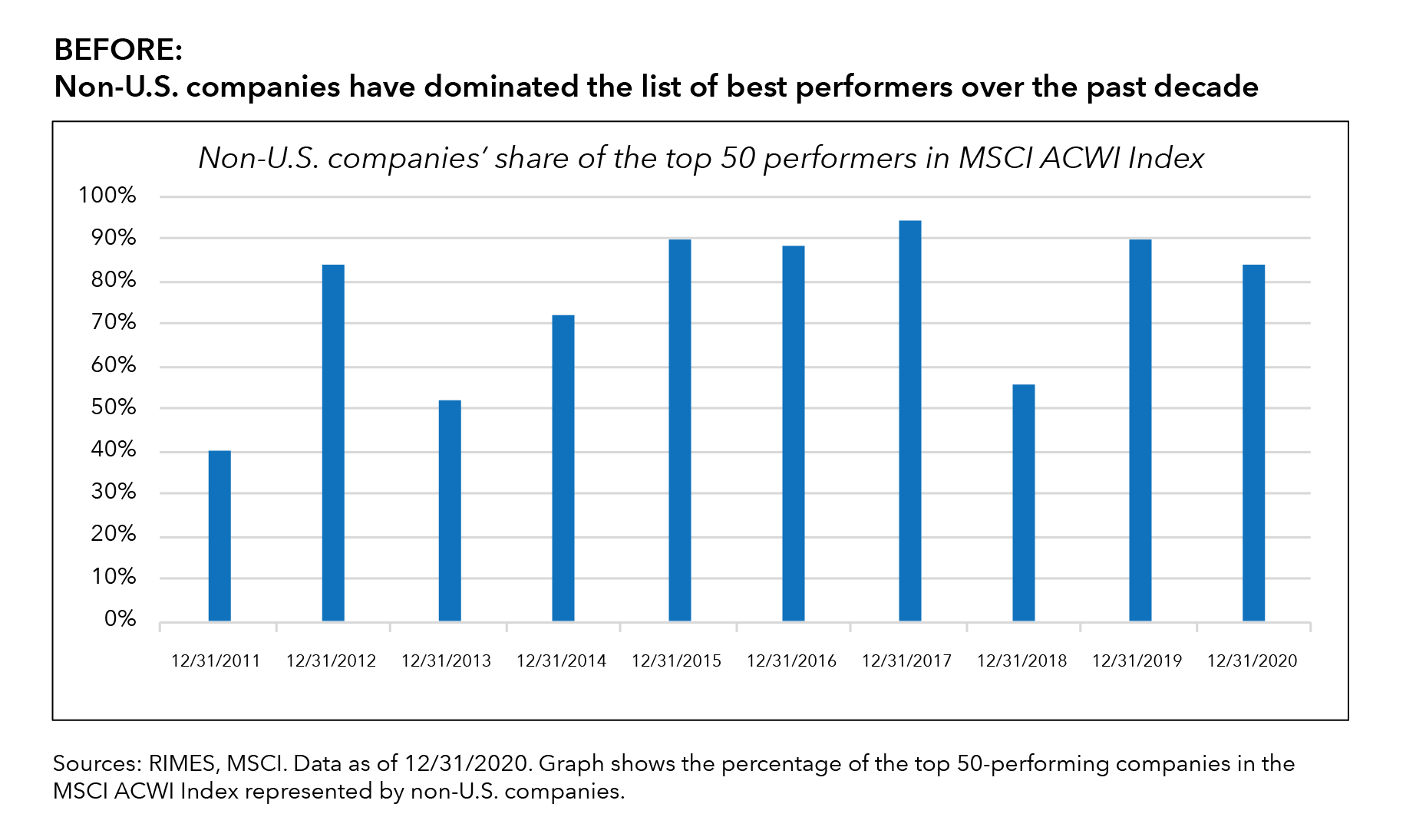
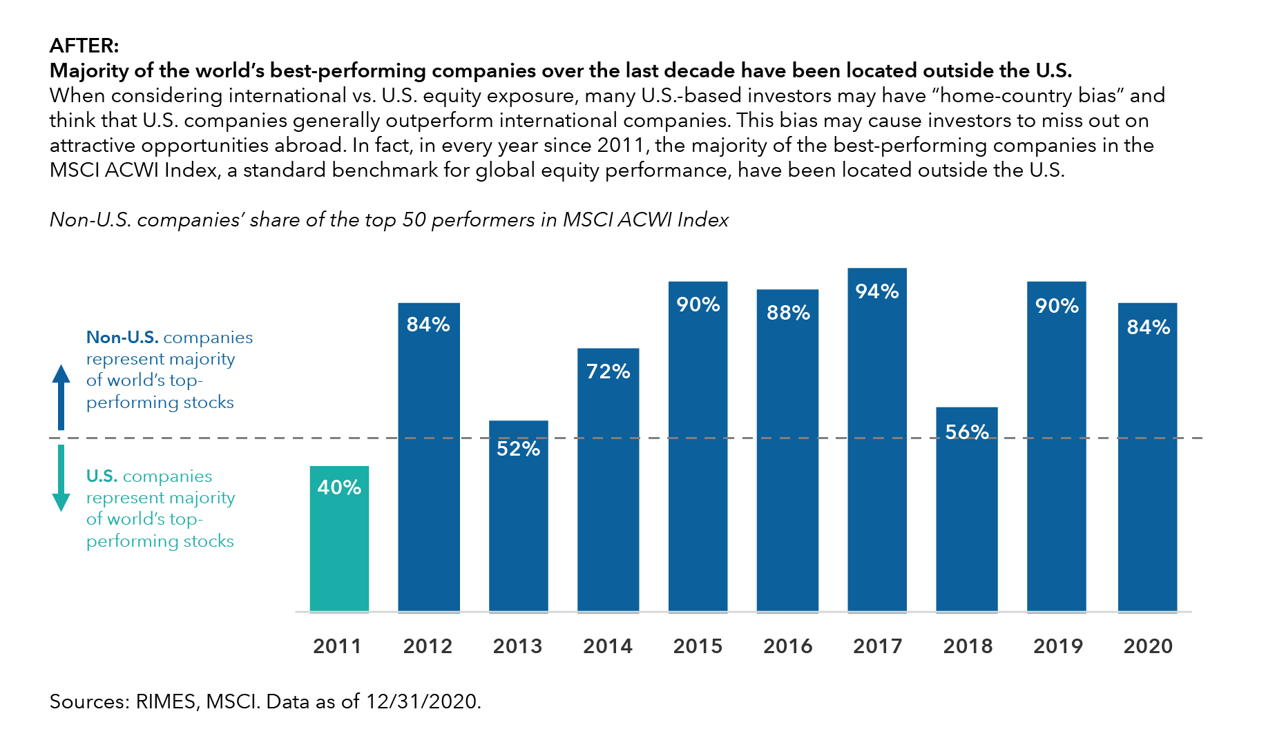
To illustrate how to put some of these tips to use, see the before-and-after example below. Notice how the addition of lead-in commentary, data labels in place of gridlines, different colors to highlight specific data points and explanatory labels directly on the chart help the reader to understand the chart more quickly.
Principle 4: Don’t force clients to interpret complex data on their own
When sharing more complex data and charts, Chen offered this rule of thumb: It should take less than 30 seconds for your audience to understand the essence of any chart or graph. If they can’t, the data or its presentation is likely too complex and needs to be simplified.
Chen observes that when telling a story with words, people carefully consider how to structure it so there is a natural flow of information. Yet, when it comes to data visualization, authors often leave it to their audience to figure out the story on their own. “This is the biggest pitfall I see in data visualization,” Chen said. Don’t assume that your audience will be able to glean the key takeaway from a graph, chart or other visual element just by looking at the data. You will often need to use the headline or the caption to directly spell out what is noteworthy about the data and how it relates to the bigger story.
In some cases, your visuals may simply have too much going on. Common examples of overly complicated charts include the use of multiple axes that are hard to follow and too many indexes or data points in a single chart. This can create clutter that is hard for the reader to sort through. “Think deeply about your audience. Will they be able to digest the information easily? If not, you may want to scale back the data to a simpler illustration,” Chen said. If there are several dimensions to the data, try breaking it down into multiple charts rather than cramming it all into one visual. Over time, you can introduce more advanced illustrations as your audience gets more comfortable with the ideas you’re presenting.
How can you tell if your data are easy to read and understand for people with varying levels of investment sophistication? Try this time-tested method: Share the document with a family member, friend or colleague, and then ask them to describe their takeaways from the chart.
Principle 5: Consider more advanced data visualization tools and technology
For RIAs who are interested in more advanced ways to improve their data and make it come to life for clients, there are several innovative tools available today. Interactive business intelligence and data visualization tools, for example, can help RIAs organize their data and analyze it more intuitively. When used properly, these tools can strengthen not just your client communications but also your internal dashboards and performance tracking. Some examples of business intelligence tools include Tableau, Power BI, MicroStrategy, Qlik Sense and Sisense.
There are also several portfolio management tools that can be used to present portfolio data and risk metrics in an interactive and easy-to-understand way. These programs can be especially helpful in showing how various economic factors or market regimes could affect a client’s portfolio and progress toward the client’s goals. Examples of these tools include HiddenLevers, Riskalyze, RightCapital, MoneyGuidePro and eMoney Advisor.
Championing better data visualization at your firm
Data visualization starts with a commitment to helping your clients better understand their financial picture, goals and investments. While implementing these changes doesn’t necessarily require a large investment in terms of dollars, it does take time, effort and a thoughtful approach to storytelling.
Effective data visualization isn’t just the responsibility of the marketing and communications professionals on your team. Everyone within an RIA should be committed to using the best practices of data visualization to create clear and compelling communications. RIA leaders need to champion this effort and educate their team members about its importance. By training your team on the principles of data visualization, you can more clearly articulate your expertise and help your clients focus on the things that ultimately matter for their financial success.
 Myra Chen

